If you’re into photography, you’ve likely stumbled across the term “histogram” at some point. It sounds intimidating, like something you’d need to bust out a calculator for, right? Well, the good news is, you don’t need a degree in rocket science to understand it. Histograms are actually one of the most helpful tools for photographers—especially if you’re looking to perfect exposure (or just not completely blow out your photos with crazy highlights or shadows). This camera histogram tutorial will help you out to understand the basics you need to know in order to avoid mistakes on the field.
So, grab your camera, maybe a cup of coffee, and let’s dive into the wonderful world of histograms!
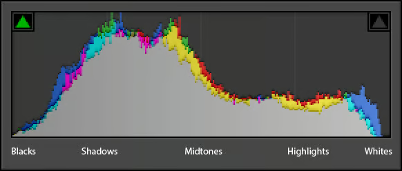
What is a Camera Histogram?
A histogram is basically a graph that shows you the tonal distribution of an image. In simpler terms, it tells you how bright or dark your photo is. If you’ve ever seen a chart with jagged lines while reviewing your photos, congrats, you’ve already met your camera’s histogram.
Imagine that the left side of the graph represents the darkest parts (shadows) of your image, and the right side represents the brightest parts (highlights). Everything in between is the midtones, aka the shades of gray that are neither too dark nor too bright.
•Left side of the histogram: Shadows (dark areas)
•Middle of the histogram: Midtones (neutral tones)
•Right side of the histogram: Highlights (bright areas)
Why Should You Care About Histograms?
You might be thinking, “Why do I even need to look at this funky graph when my photos look fine on my camera’s display?” Here’s the kicker: your camera’s screen can deceive you. The histogram, however, gives you a raw, unfiltered truth about your exposure.
Examples:
•Too dark (underexposed): If the majority of the graph is squished on the left side, your photo might be too dark.
•Too bright (overexposed): If the graph is piling up on the right side, you’re likely losing details in your highlights.
•Balanced exposure: A nice distribution of pixels spread across the graph without clumping at the extremes means you’ve hit the exposure sweet spot.
The Anatomy of a Histogram: Breaking It Down
Let’s take a closer look at the histogram. Remember, it’s just a visual representation of your image’s exposure. Here’s what to expect:
1. Shadows (left side):
If your histogram is hugging the left side of the graph, it’s a sign that your image has a lot of dark tones or is possibly underexposed. Shadows are important in many images, but too much can hide crucial details. You don’t want your shadows to completely block out unless that’s the artistic look you’re going for.
2. Midtones (middle section):
The middle part of the histogram reflects the midtones, which are the ‘in-between’ shades. A good balance here often means your photo has a natural and smooth tonal range. If your midtones are missing, your image might feel either too washed out or too contrasty.
3. Highlights (right side):
When your histogram leans heavily to the right, it’s telling you that your image is bright. If it’s hitting the wall on the far right, you’re in danger of blowing out your highlights (meaning, you’re losing detail in the bright areas). That nice white cloud in your sky might turn into an unflattering, featureless white blob if you’re not careful.
Different Types of Histograms: Not One-Size-Fits-All
There are various types of histograms that can help you better understand your images, depending on the scenario. Let’s break them down:
1. Luminance Histogram
The luminance histogram shows the overall brightness of your image. This is the one most photographers use, as it’s a quick way to evaluate exposure.
2. RGB Histogram
This type of histogram breaks down the tonal range of individual colors (red, green, and blue). If you see spikes in one color channel and not the others, it could indicate color clipping (losing detail in one color channel). It’s especially important in cases like photographing a sunset or anything with rich colors, where color accuracy matters.
Example: Sunset Photography
You’ve lined up the perfect sunset shot. The RGB histogram shows a spike in the red channel, indicating the reds in the sky are dangerously close to blowing out. By seeing this, you know to reduce your exposure or tweak settings to retain those warm, fiery tones.
How to Read a Histogram Like a Pro
Now that you know the basics, let’s talk about how to read the histogram while shooting. Here’s a fun analogy:
•Think of the histogram like a mountain range.
•If the “mountains” are stacked against the left (shadow) or right (highlight) edges, you’re losing details.
•If your “mountains” are nicely spread out across the middle, you’re generally in good shape.
But here’s the thing: there’s no such thing as a perfect histogram. The ideal histogram depends on the photo you’re trying to take. Some images naturally have more shadows or highlights.
Example 1: High-Key Portraits
In high-key photography, you deliberately overexpose the image to get that bright, soft look. A high-key portrait will have a histogram that’s skewed towards the right, but that’s okay because the style demands it. You want lots of highlights, as long as you’re not completely blowing out key details like the subject’s skin or hair.
Example 2: Low-Key Landscapes
On the flip side, low-key photography is all about the shadows and dark tones. Think of moody, brooding landscapes or dramatic portraits. The histogram for a low-key photo will hug the left side more, and that’s completely intentional.
Practical Tips for Using Histograms in the Field
Now that you understand what a histogram is and how to read it, here are a few practical tips for making histograms your new best friend in photography:
1. Check Your Histogram Before Leaving a Location
It’s easy to glance at the photo on your camera’s LCD and think you’ve nailed the shot. But lighting conditions and the small screen can deceive your eyes. Always double-check your histogram to ensure you’ve got the exposure you want.
2. Expose to the Right (ETTR)
Many photographers swear by the ETTR technique. The idea is to push the histogram slightly to the right (without clipping the highlights) to capture more detail in the shadows. You can always darken the image in post-processing without losing detail, but bringing back blown highlights is much harder.
3. Use Highlight Warnings
Some cameras have a setting that makes overexposed areas blink on your display (often called “blinkies”). These warnings combined with the histogram can help you avoid blowing out critical details in the highlights.
Wrapping Up
At this camera histogram tutorial, we have seen that the histogram might seem like a daunting tool at first, but once you get the hang of it, it’s like having an exposure superpower. Whether you’re shooting high-contrast scenes, playing with moody shadows, or trying to capture that perfect golden hour light, your histogram will help ensure your photos are perfectly exposed—every time.
So, the next time you’re out shooting, pay attention to that graph. It’s a tiny chart with big implications for your photography skills! Happy shooting!


